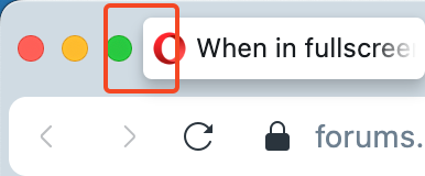
I think it's not very pretty and it's not practical because it's hard to get in quickly. You have to aim to hit a button or click on a tab. It would be cool if the regular tab was as tall as the tab in the island. It would also be nice to make the tabs a little longer and add more space between elements.
Best posts made by kolyapeno
-
Very small tabs and element spacingsTab Islands, Tabs and Workspaces
-
RE: When in fullscreen mode on Opera 1, the browser displays a strange frame around the video.General
I agree, it's very strange. But not just in the video, but in the rest of the page. It'd be better to leave such modularity only on the address bar and above