Hello, brand new to using opera air and I love the UI changes. It's a lot less busy and a lot more chill, and I particularly like that you can autohide the side bar. I'm coming from GX so everything is a lot more toned down.
I do have some feedback, though. Frankly, the speed dial page should allow for some customization. Personally, it bugs me that the speed dial icons are so far to the right of everything. It feels out of wack and not in line with any other browser, and not in a good way. I would like the option to either build the bubbles from the right, or to have the bubbles centered.
Also, on dark ambience mode, the user icon next to easy set up is highlighted white, which is very distracting. 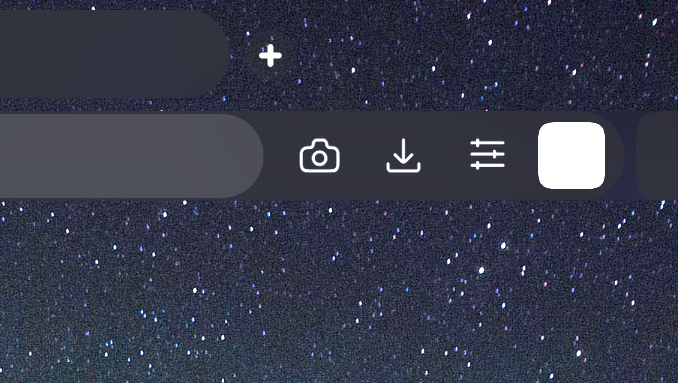
Of course, these are only suggestions, but as the browser is new, I feel like these things are important to be made aware of.