TL;DR at the end.
Definitely liking most of the UI in One, however there are some changes that definitely stick out negatively.
Issue 1:
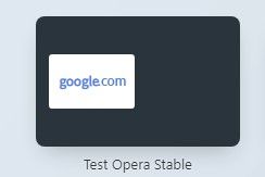
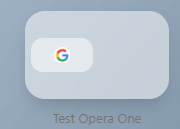
Speed Dial background color. The theme settings have no role in changing the background of the Speed Dial folders. We are stuck with a semi-transparent white that shines like the sun for those of us who prefer darker colors. Example of each is below with a similar style and dark mode activated.
Stable:

One:

Little fun thing to try is if you turn Dark Mode on while looking at the second picture it actually looks decent, but if you turn Dark Mode off while looking at the picture it looks exactly what you'd see regardless of mode in real life.
Issue 2:
Address Bar colors in InPrivate. Similar issue however this one is affected by the Light and Dark Modes, just functioning in a way I think defeats the purpose. Let's take a look at the differences between a regular session and InPrivate with One.
Regular Non-InPrivate Session Dark Mode:

Looks good for Dark Mode, right?
InPrivate Session Dark Mode:

That white address bar definitely is Dark Mode alright. For the sake of things the below image is set to light mode.
InPrivate Session Light Mode:

Almost as if the modes are set to change certain elements to the appropriate theme (Possibly a bug?). Maybe even some way of differentiating the two types of windows, but if that is the case that is not the way to go about it.
To conclude this rant I really like One so far, but design changes need to be made (If this is a bug then all the same something to fix). Backgrounds need to be darker when actually set to Dark Mode for Speed Dials (Similar to the experiment I mentioned above maybe even slightly darker) and for InPrivate the entirety needs to reflect how a regular session does when set to Dark or Light Mode.
Thanks!


