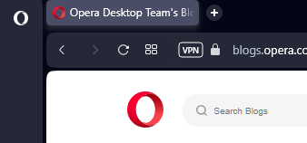
There is still hope guys, I´m testing the developer version and in the lastest updated the Home Button was added, so is just matter of time to reach stable version.
Opera One(versión: 103.0.4892.0)

Do more on the web, with a fast and secure browser!
Download Opera browser with:
There is still hope guys, I´m testing the developer version and in the lastest updated the Home Button was added, so is just matter of time to reach stable version.
Opera One(versión: 103.0.4892.0)

@gacornell
Hi
They removed it, but developer version 103.0.4892.0 brings back the home button, so I think it's only a matter of time before it becomes available again after a while in the stable version.
@canadagoose4everreturns Hi, I remember that time, when the switch from presto take place the browser comes out in a very basic state, even without bookmarks, This time with Opera One things gets a bit worse at least in the visual (speed dial, round edges everywhere, small padding between tabs), for me it was a Shock, and I survived the switch from presto to the current browser but now I have doubts about it.
I don't want to leave Opera and maybe I will switch to Gx for a while to see which direction the Normal version takes.
I call this downgrade rather than upgrade.
My suggestion with side bar will be decrease is width (too much padding), as is it right now it takes a lot of space, maybe if they make the bar a little thin and remove the border in the icons.
Theres is other things that bother me, tabs look awful but I don´t know how they can fix them, it seems that this new design brings a lot of problems.
@zauberfritz You´re right, very odd design, they add too much margin in some items and they remove it in others.
@gedonis Oh I just forgot to mention that a workaround is to increase the zoom in the start page, click ctrl + mouse scroll wheel, let say something like 125% and they will look similar to the originals, even if you close the tab the zoom setting will be remembered. It is not perfect but will do the job.
@leocg Thank you! I found it, imho this option should be enable by default.
Sad news, today the developer update removed the homepage button again (103.0.4906.0), I'm starting to think that developers are adrift, they are making a lot of anti-user decisions.
@gedonis Oh I just forgot to mention that a workaround is to increase the zoom in the start page, click ctrl + mouse scroll wheel, let say something like 125% and they will look similar to the originals, even if you close the tab the zoom setting will be remembered. It is not perfect but will do the job.
@gedonis It is not yet possible, hopefully they will fix this in the near future.
@donjd The startup animation!, is inconsistent, in the developer version it was shown only on the first boot after that the animation is no longer displayed, it is supposed to be that way (only on the first boot or after an update), but sometimes it continues to be shown every time. To me it continues to appear in each boot in Opera Gx stable even when the option not to show is checked.
@gacornell
Hi
They removed it, but developer version 103.0.4892.0 brings back the home button, so I think it's only a matter of time before it becomes available again after a while in the stable version.
@zauberfritz You´re right, very odd design, they add too much margin in some items and they remove it in others.
My suggestion with side bar will be decrease is width (too much padding), as is it right now it takes a lot of space, maybe if they make the bar a little thin and remove the border in the icons.
Theres is other things that bother me, tabs look awful but I don´t know how they can fix them, it seems that this new design brings a lot of problems.
There is still hope guys, I´m testing the developer version and in the lastest updated the Home Button was added, so is just matter of time to reach stable version.
Opera One(versión: 103.0.4892.0)

@canadagoose4everreturns Hi, I remember that time, when the switch from presto take place the browser comes out in a very basic state, even without bookmarks, This time with Opera One things gets a bit worse at least in the visual (speed dial, round edges everywhere, small padding between tabs), for me it was a Shock, and I survived the switch from presto to the current browser but now I have doubts about it.
I don't want to leave Opera and maybe I will switch to Gx for a while to see which direction the Normal version takes.
I call this downgrade rather than upgrade.