@andrew84 , yes, I also have this picture, but only after 3 seconds.
Everything is the same as without this key.
S
Latest posts made by serega-da
-
RE: Do not dim the entire Picture in Picture (PiP) video on mouse hoverSuggestions and feature requests
-
RE: Do not dim the entire Picture in Picture (PiP) video on mouse hoverSuggestions and feature requests
no, I checked on different browsers on Chromium. This flag is only available at Opera. And it doesn't work.
This whole story looks even more stupid, when I see that one designer has darkened the entire window, and another designer has highlighted a button , rather than killing the picture.
But they do not know about each other, although they work in neighboring offices.
This back for button drawn so simply:
boreder-radius: 50%;
background-color: #0008;Imagine that in the same way, in 1 line code, the entire window is darkened.
One a string of code , that users have been asking to remove for 5 years.
There is no need to invite a team of developers, develop new engines, or master new technologies. Just remove 1 line of code - someone's old mistake. Perhaps that designer is no longer on the team. But his mistake lives on.
Because developers don't read their forum. -
RE: Do not dim the entire Picture in Picture (PiP) video on mouse hoverSuggestions and feature requests
Try searching the video for the right moment. You show me progress bar (s), and I need the video itself, every pixel of it. And I will find the progress bar on my own.
It's PIP. So I can use the main browser window to work. I can accidentally carry a mouse over a PIP. Hundreds of times a day. I call this PIP a traffic light - I have so many negative emotions from this flashing. And all for buttons that I don't need.
-
RE: Do not dim the entire Picture in Picture (PiP) video on mouse hoverSuggestions and feature requests
By the way, Youtube himself does not care much about his users - and no one has complained yet. On Shorts, white text on the video: channel name, tags, music does not stand out at all. And everything is fine. If the text is not visible, wait 1 second - and the video will change. No need for big white buttons (everyone already knows their purpose, placement) there is no need to spoil the video itself.
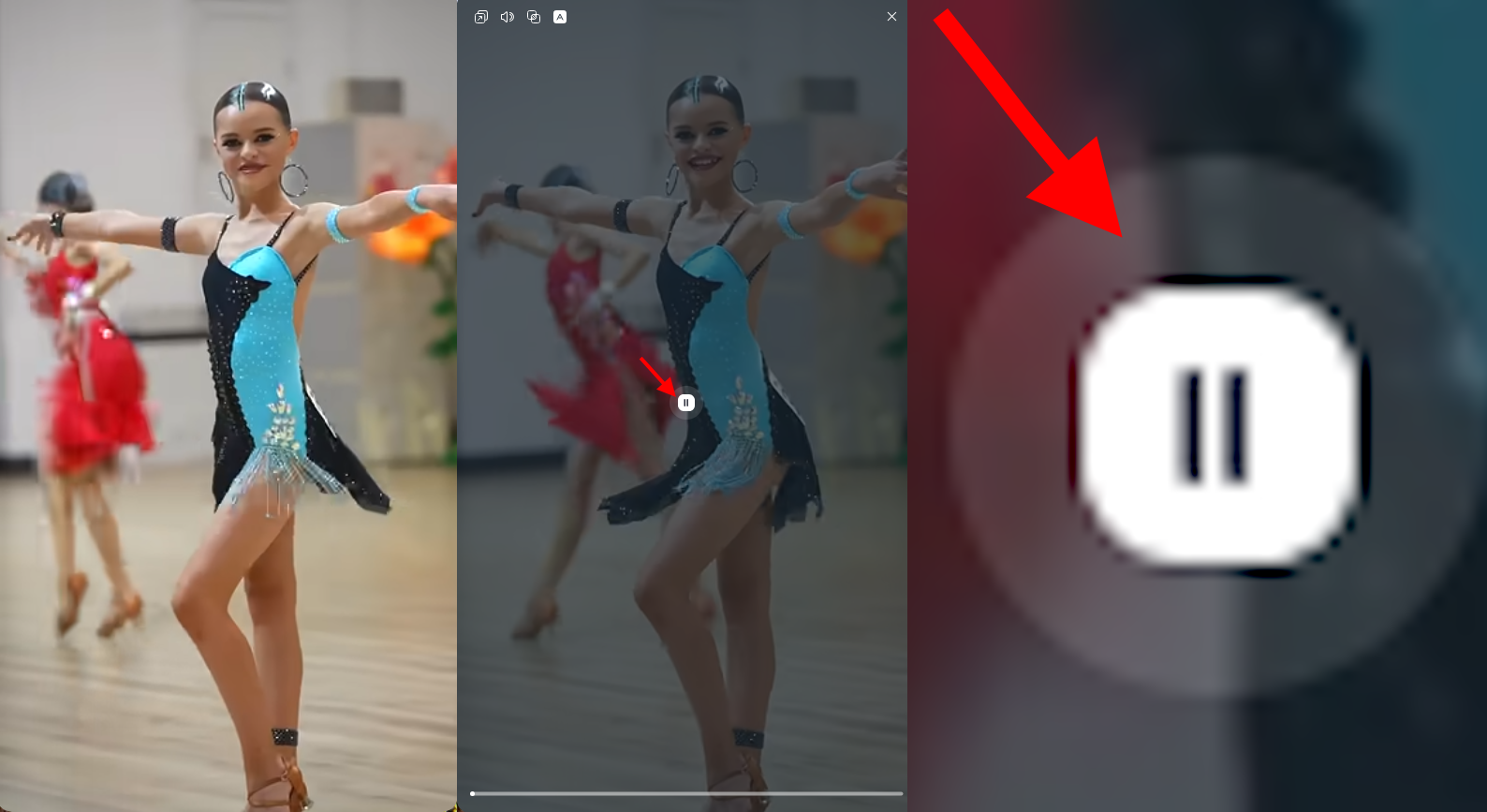
- We are on desktop - what does the pause button do in the center of the screen???
I’ll tell you a secret - In the center of the screen there is a person’s face, eyes, his nose, text, program code. Anything. But browser buttons always look very inappropriate there.
Remove these buttons from the center - I don’t have fingers with which I will poke at the FullHD center. -
RE: Do not dim the entire Picture in Picture (PiP) video on mouse hoverSuggestions and feature requests
I can copy pictures from there. It is clearly visible that YouTube approached the issue less clumsily. Google knows what a linear gradient is. Everything is solved in 1 line of code.
Do you see on that forum the only user who proposed a ready-made solution, I with a beautiful "banned" tag? It's me. I bow low. There, the Vivaldi moderators (who themselves do not know this CSS) appreciated my proposal.
I know that many users have looked at browser code looking for this PIP to remove it themselves.
I looked too, but found nothing. So, this is a serious problem, an unnecessary solution that prevents us from living.Here's the simplest gradient I came up with. And it will solve the problem of invisible buttons. And this is approximately how the Youtube-player works.
linear-gradient(to bottom, transparent 90%, rgba(0, 0, 0, 0.3) 100%) -
Do not dim the entire Picture in Picture (PiP) video on mouse hoverSuggestions and feature requests
There is a similar topic on the forum of another browser.
For at least 5 years, users have been asking developers to remove the PIP darkening under the mouse.
Do I want to ask you: Why darken an entire window? For one button in the center? It takes up 1%, but you darken all the other 99%. I personally don’t need this 1% - I can look at these buttons without your help.
Video (where the screen is completely white (where one button may not be visible), exactly 0.000001% relative to all other videos. There are no completely white videos. I don't know how to convince you. Again, you darken 99.999999 % of the video, where the center button is perfectly visible in the video itself, without CSS help. -
RE: Какой дурак придумал новый этот интерфейс?Русский
@zeonish коллега, я немного знаком с языками.
Отступы: да , многовато, но не критично. Ты видел ARC ? Умнож эти отступы на 2.
Закругление: Даже не твоем скрине видно, border-radius: 3px ; Не 10, не 30, а 3-4px.
Это отлично.Шрифт да, мелковат. Cтандартный Arial .Но спасибо, что не New Times. И то хорошо,
Обидно, что все это настраиваетсяя буквально в 2 строки кода.
Других обвинений ты не привел .Я восхищался сложностью интерфейса . Все асболюно браузеры используют стандартную среду разработки, только галочки ставь. Это колхоз из прошлых веков. Opera GX сделана мощно. Похоже, они весь инерфейс настроек писали с нуля. На голову выше всех остальных.
-
RE: Какой дурак придумал новый этот интерфейс?Русский
@zeonish а что не так в интерфейсе ? Я когда первый раз открыл Opera GX , тогда и понял, как должен выглядеть браузер будущего. А с выходом новой Opera One -- такие же впечатления.
Хоть я и не любитель украшений, но я вижу огромную работы авторов.