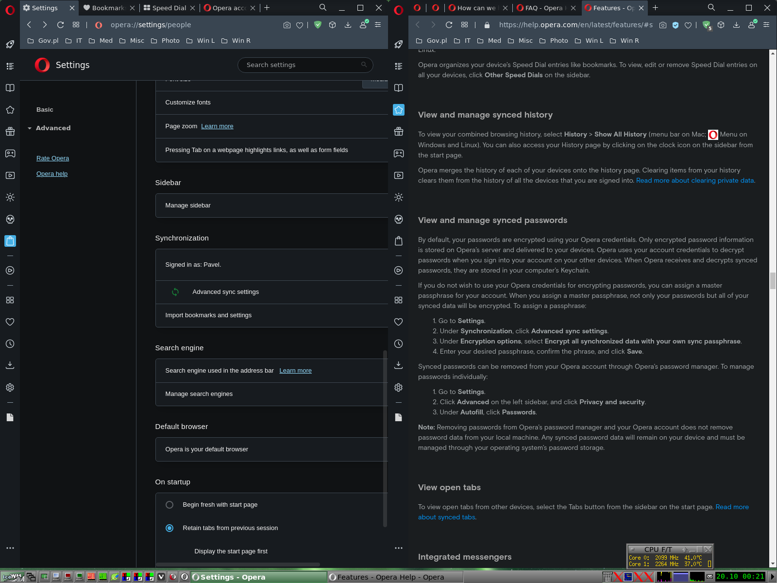
Some vertical division lines on setting pages are not movable
-
A Former User last edited by A Former User
Debian Testing
Version: 73.0.3847.0
Opera is up to date
Update stream: developer
System: Debian GNU/Linux bullseye/sid (x86_64; Unknown)
Monitor: CRT 1600x1200I'm using daily two window option imitating two vertical tile layout similar to that found in Vivaldi browser. My basic monitor is CRT 1600x1200 px semi prof type. That's why I have to turn to +/- zoom option many times, but even such invention is not enough. Hence my request to make Opera settings/help/tabs pages more efficient and adaptable.
[Fig. 1] Left Setting pages is not fully visible.

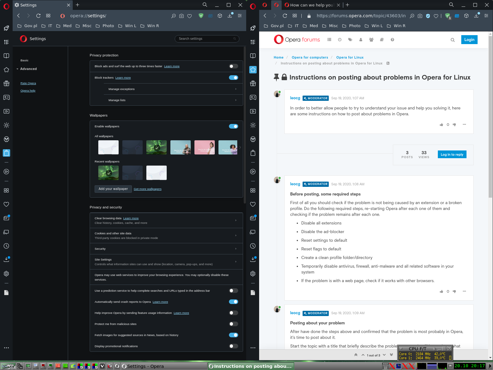
[Fig. 2] Left Setting pages is fully visible at -75% zoom. I can leave the 100% zoom and use bottom slider, but it's not comfy. As you may see there are a lot of empty vertical areas. too It'd be better to have the division vertical line movable left/right.

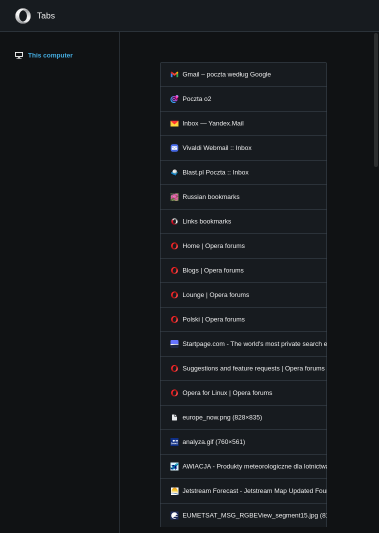
[Fig. 3] This Tabs page should have movable border line as well.
