Inactive Window Shading
-
A Former User last edited by
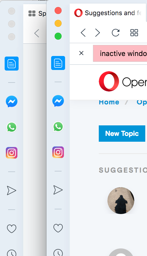
Usability would be improved if inactive windows were more visually distinguishable from active windows. The only changes I see are that the macOS window buttons (the stoplights) go grey. This has led me to often close the wrong window because it looks like a window is active when it is not.
I suggest the following visual changes for inactive windows:
- greying (or dimming) the sidebar icons
- changing the window bar from light grey/blue to a lighter grey
- dimming or graying the favicons in the tab bar
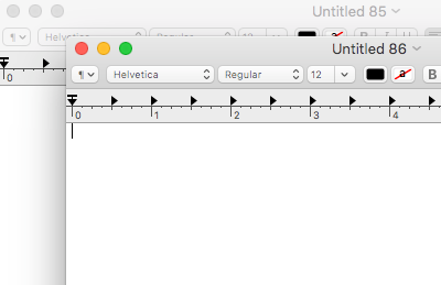
See attached screenshots showing comparison between overlapping Opera windows vs TextEdit windows for contrasts of UI elements "fading" in inactive windows.
Thanks for your consideration,
xander09Opera 68.0.3618.125
macOS 10.13.6
