Redesigning settings
-
jojo0587 last edited by jojo0587
I know that such settings in Opera have been around for a long time. But yes, I don't like them. I know that I could have written this suggestion earlier but as we say in Poland: "lepiej późno, niż wcale" ("better late, than never").
In the current settings I don't like the fact that there are 2 groups of settings in the left part and one is collapsible and contains sub-groups. In addition, if you enter the settings, the one sub-list is always collapsed,
so after going to the settings we can quickly switch between basic and advanced settings (only who remembers what option is in which part? I don't). And additionally advanced, we can expand and here there are 3 sub-options. Only that in my opinion it is definitely not enough, to quickly find a specific option without using a search engine.That is why my suggestion is to divide the settings into more categories. I made amateur graphics how it would look like.
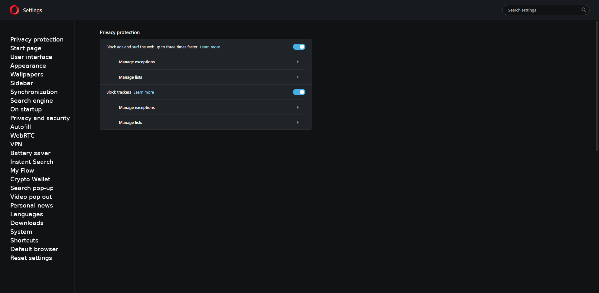
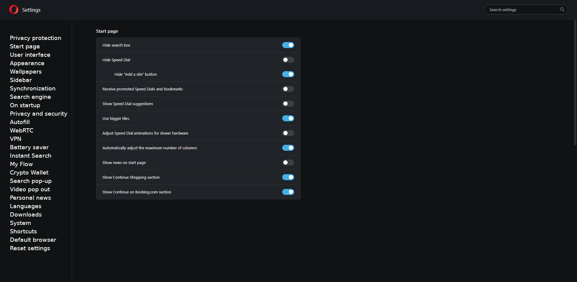
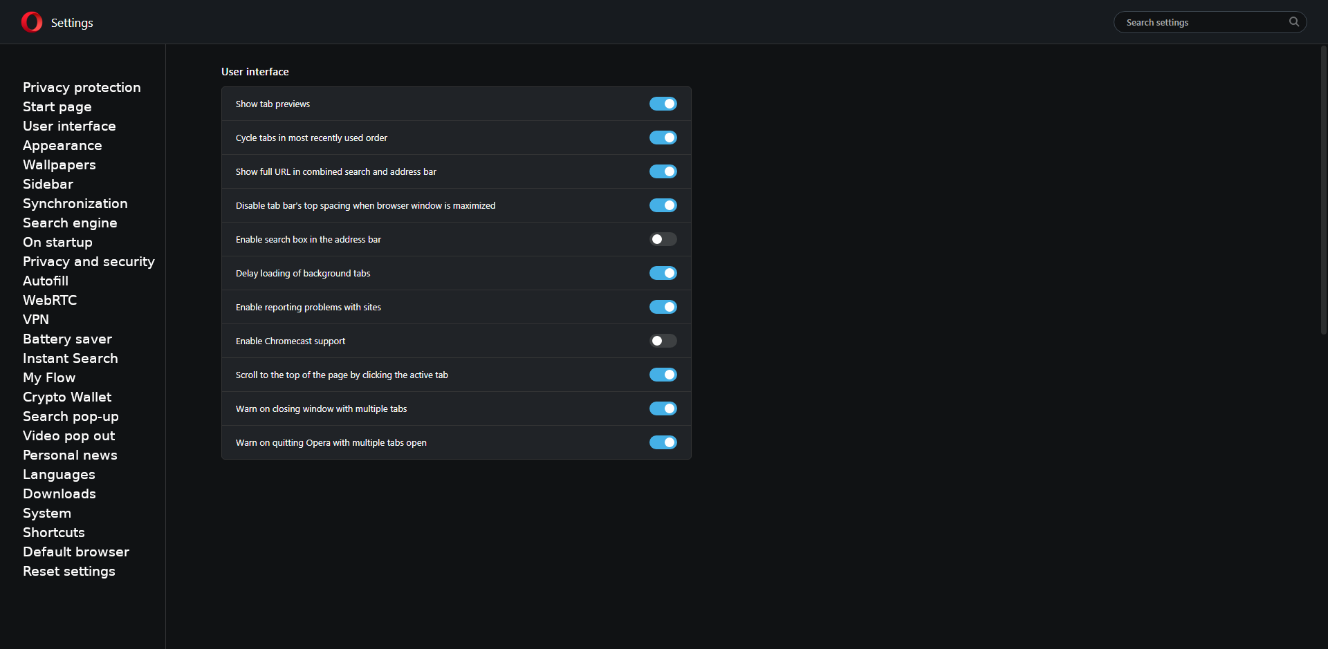
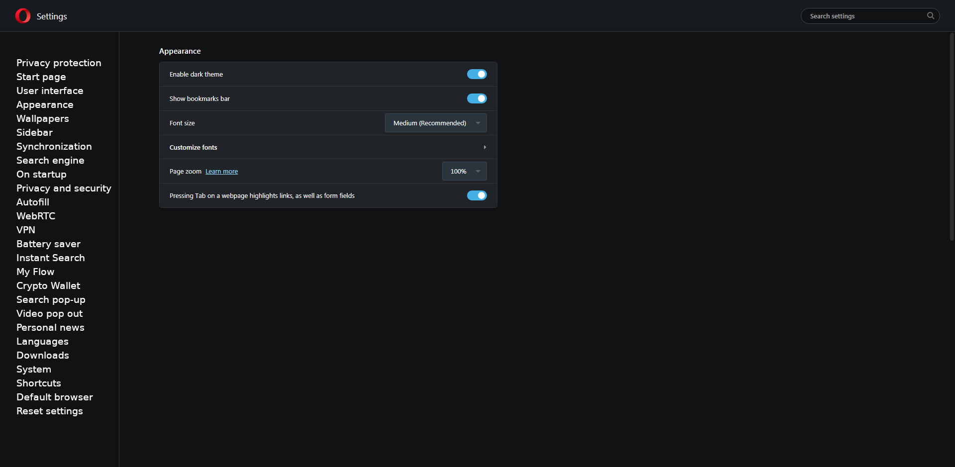
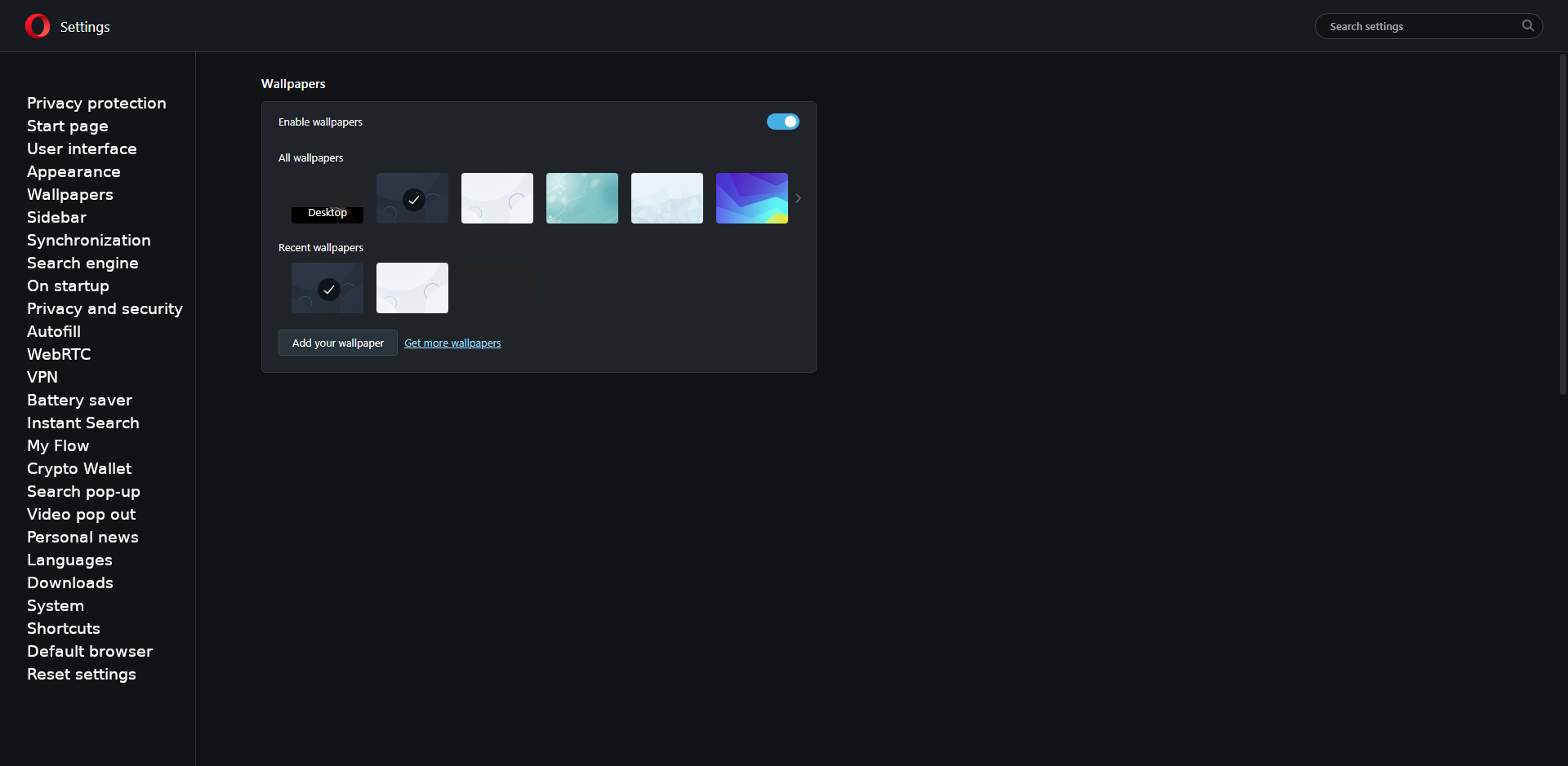
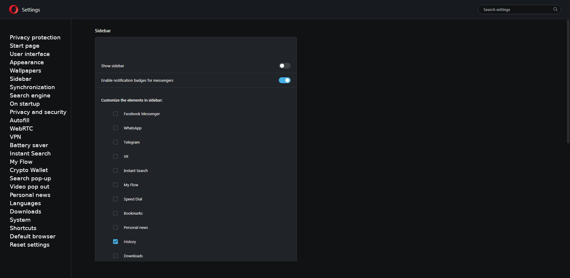
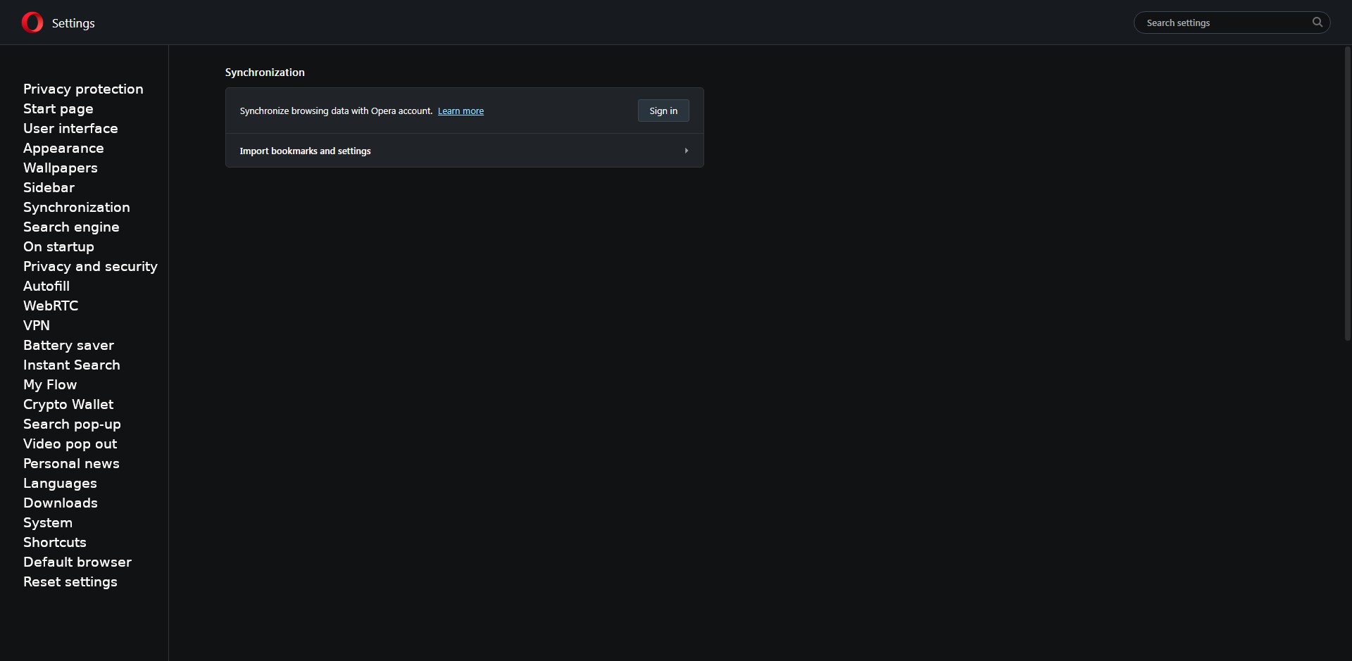
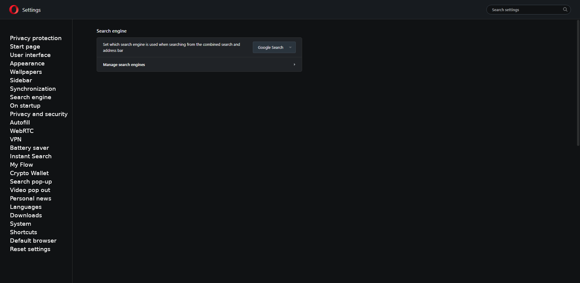
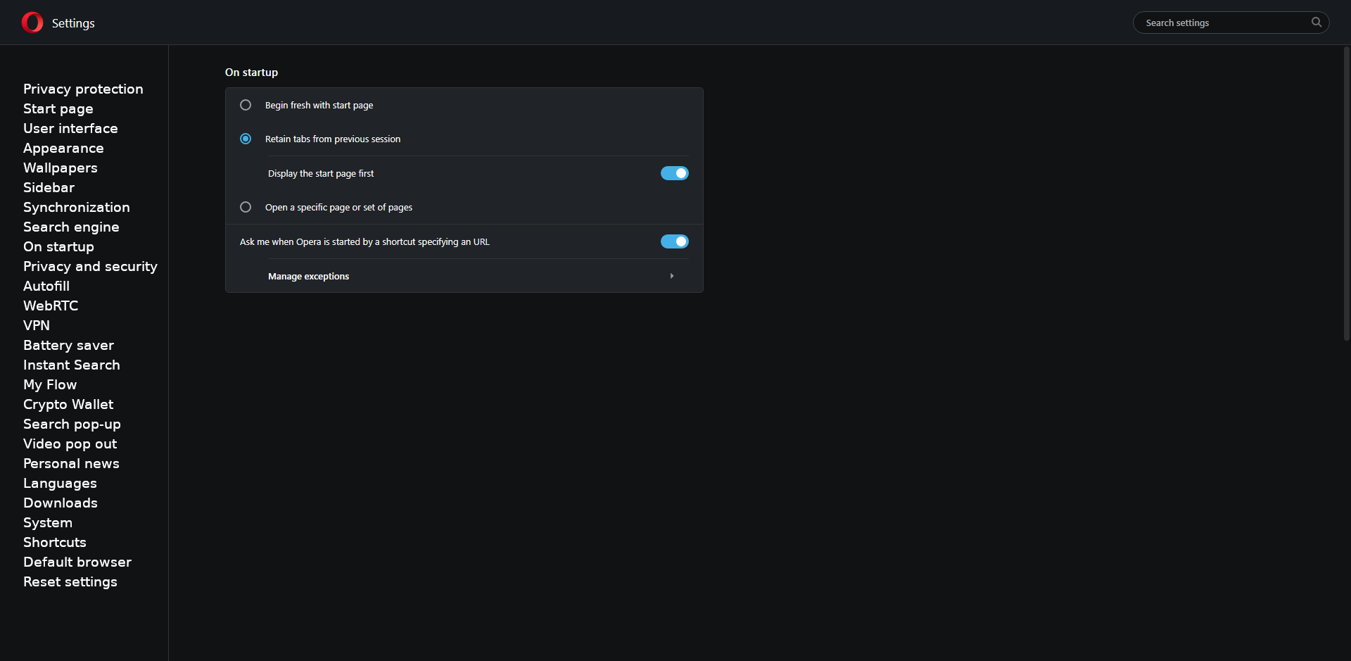
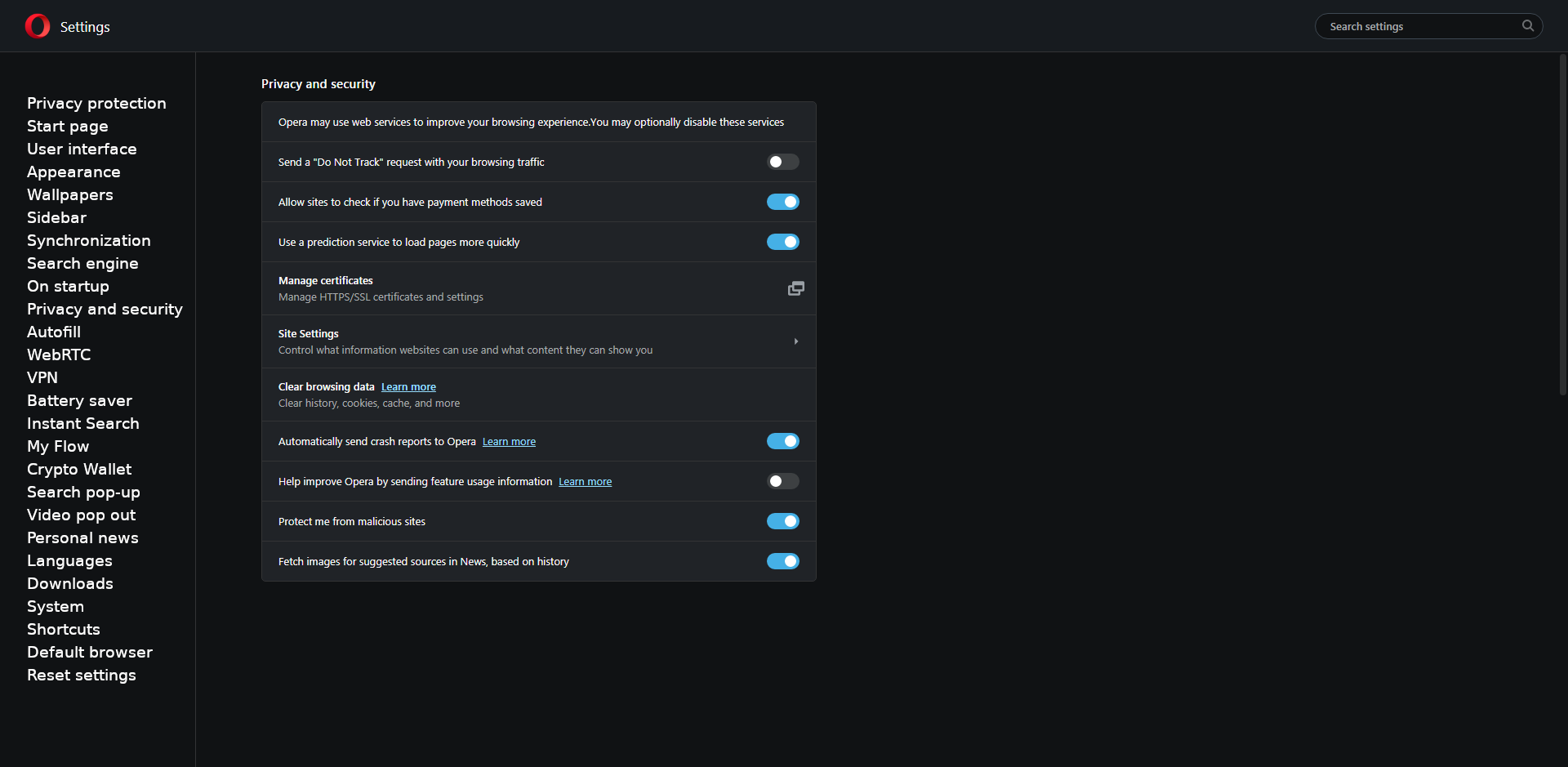
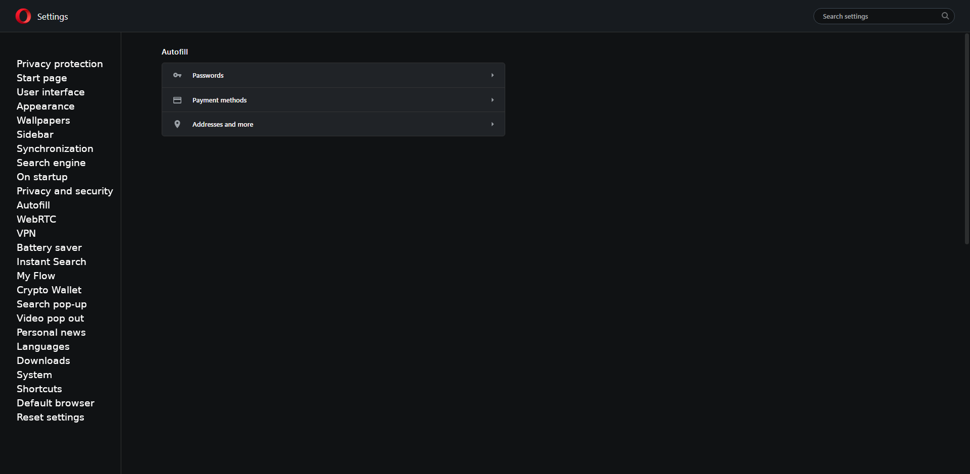
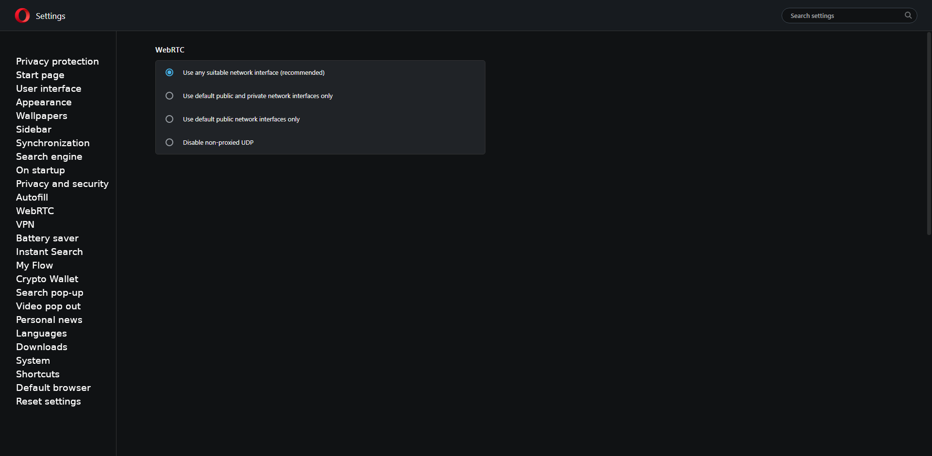
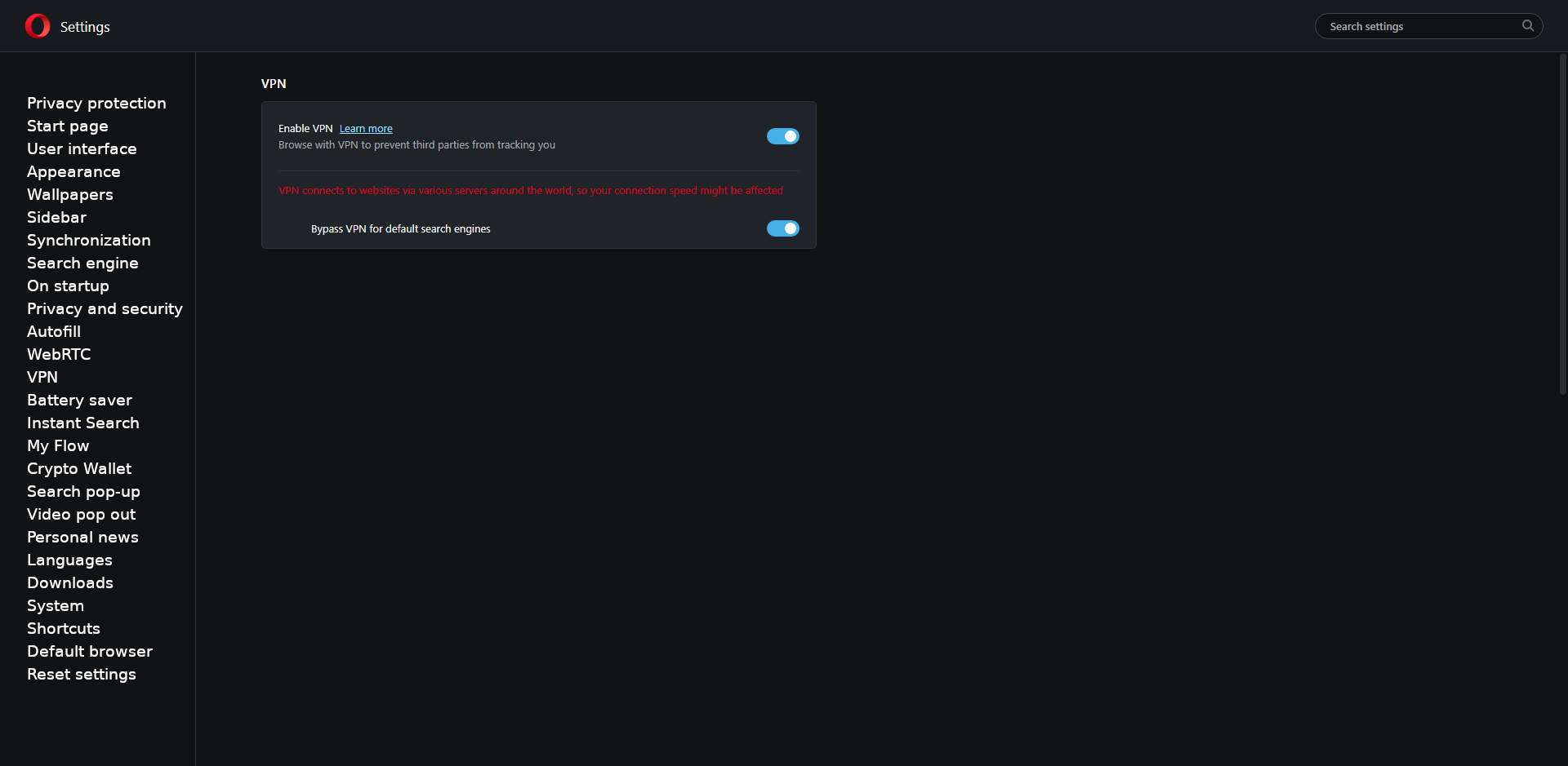
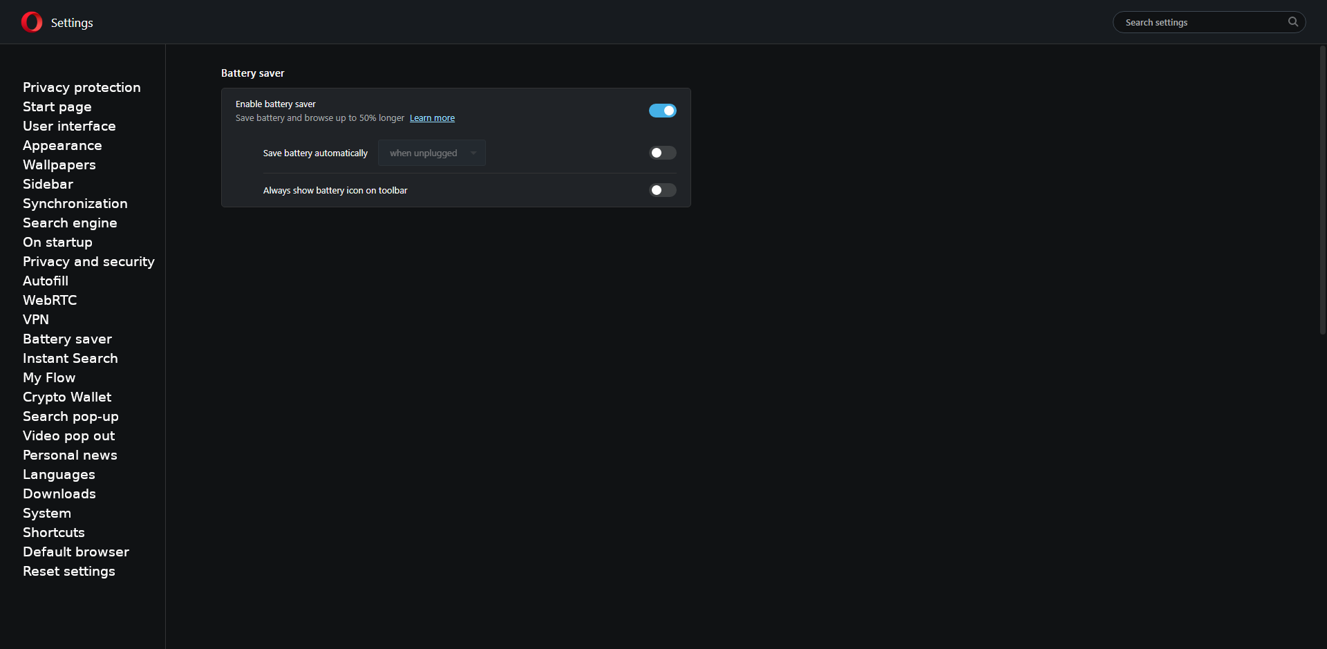
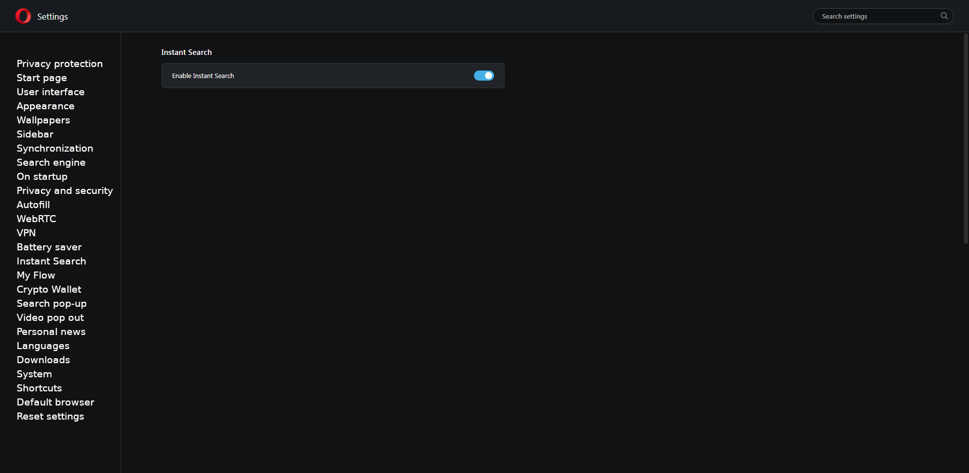
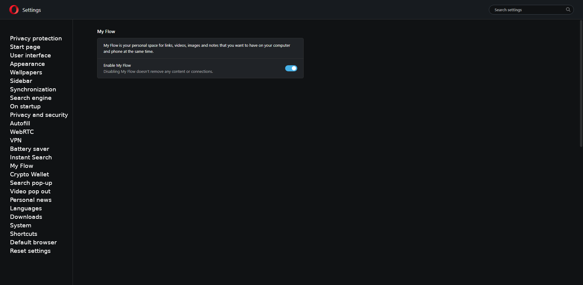
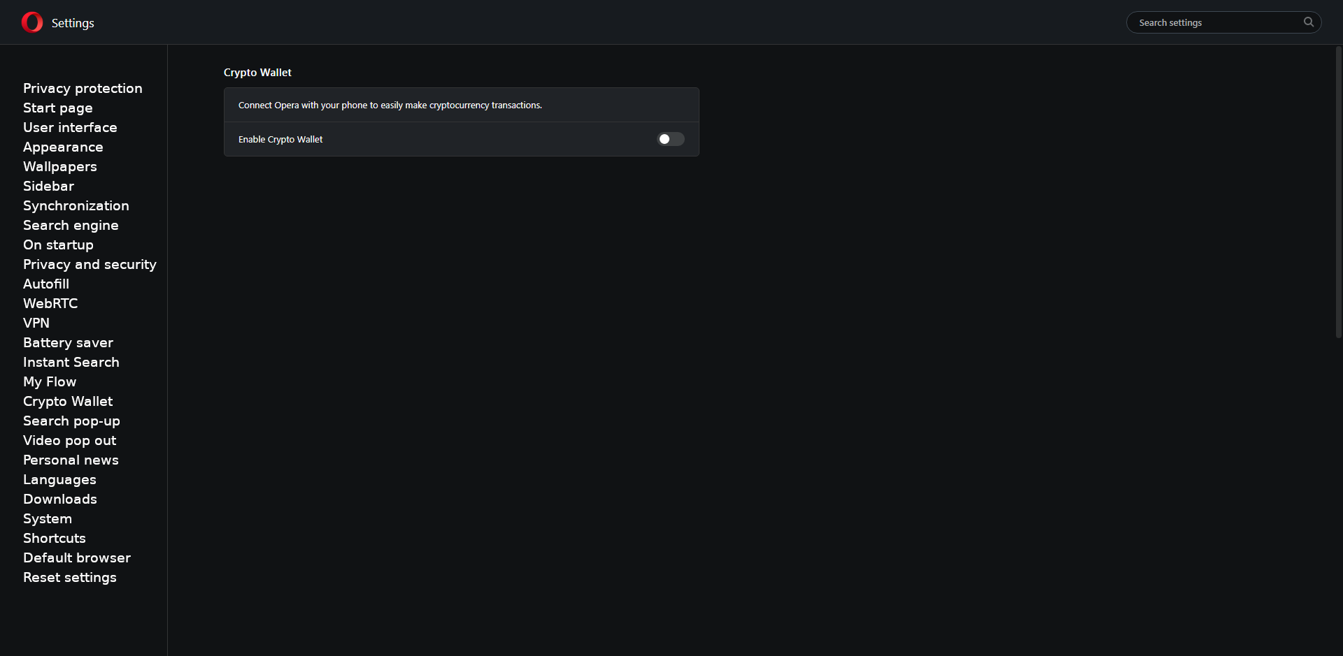


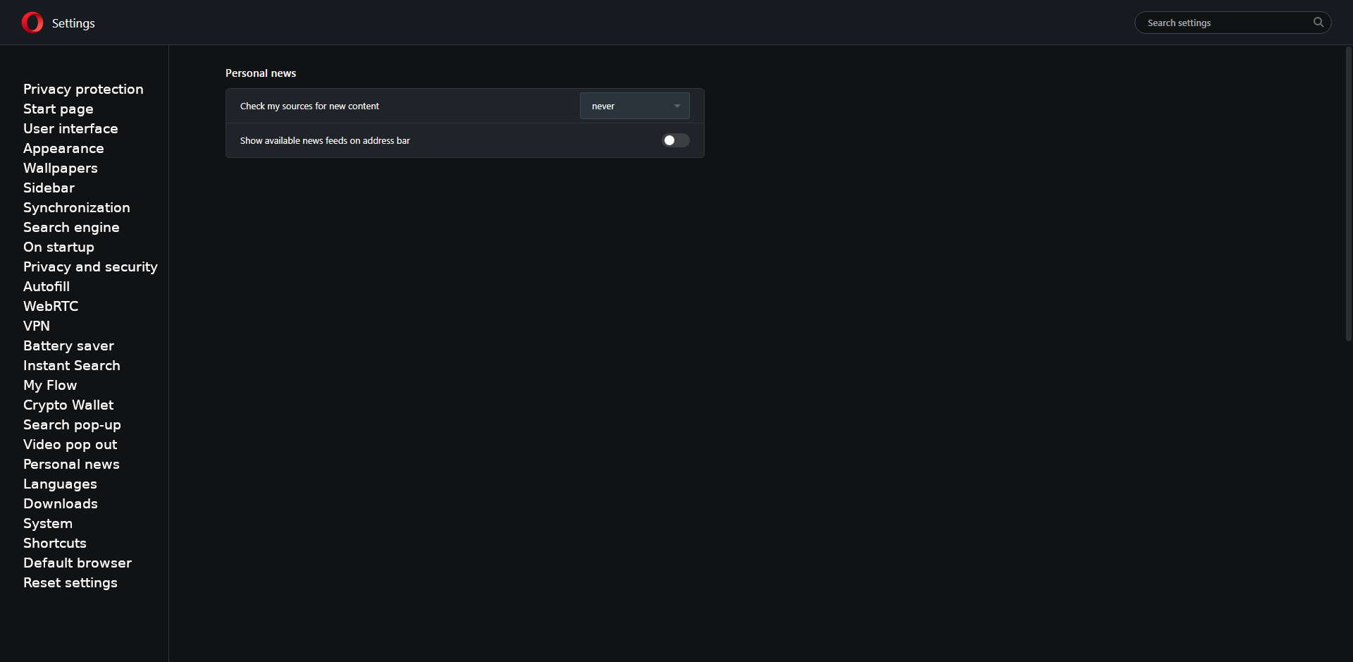
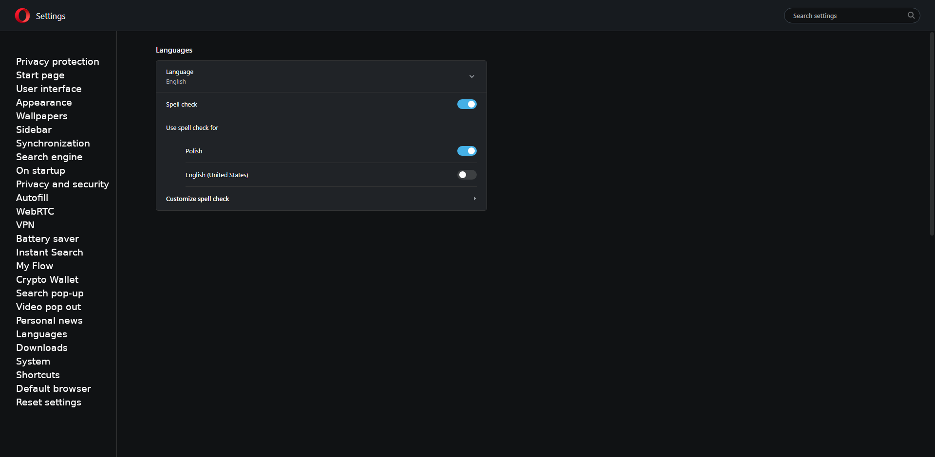
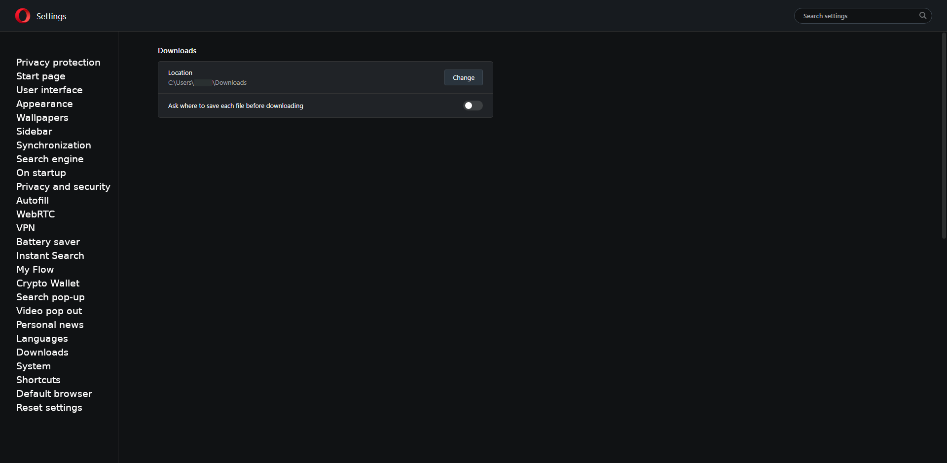

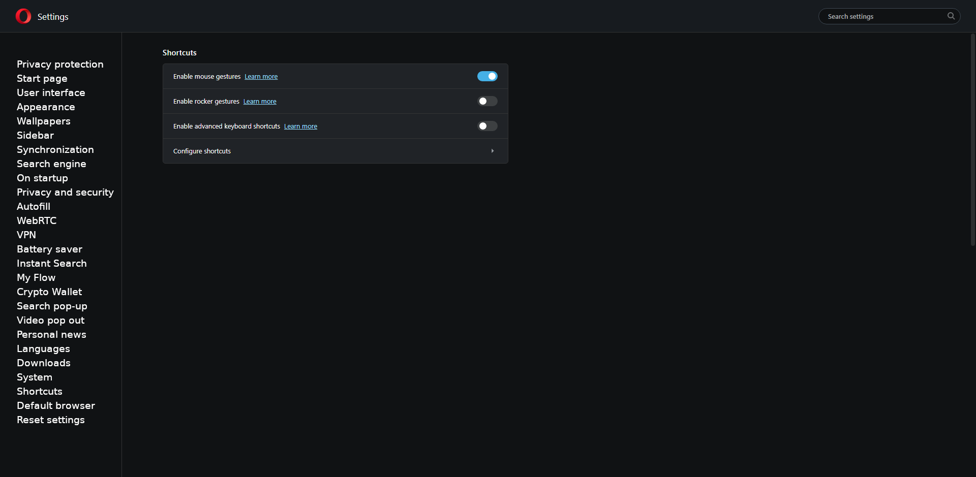
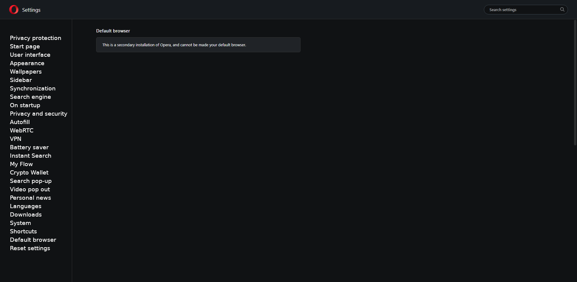
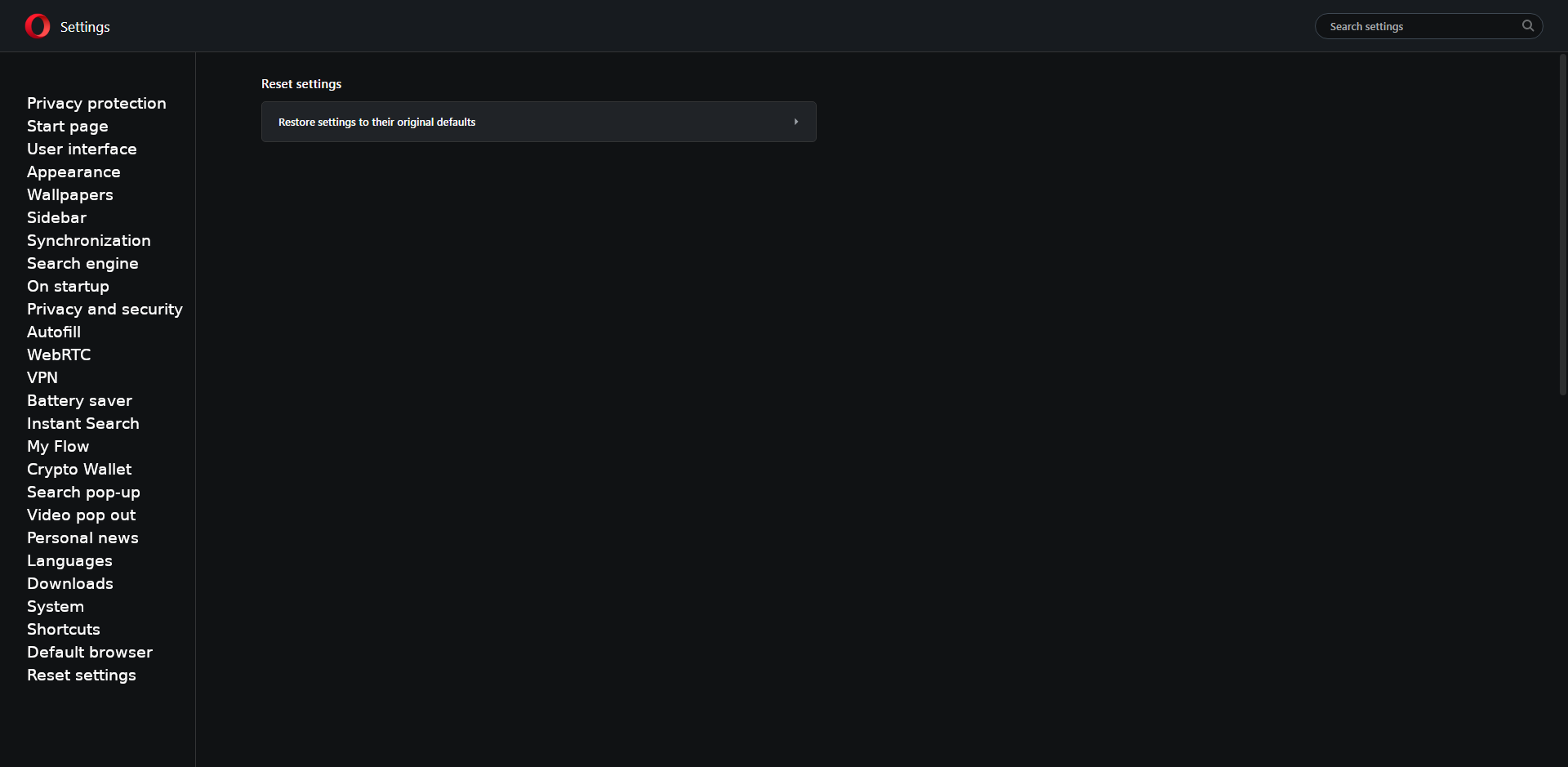
My proposals for changes in Opera (Google Document).
- There are not enough signs to put all the links here. -
jojo0587 last edited by
Finally!

What’s new?

Reorganization of pages added to opera://settings
https://blogs.opera.com/desktop/2026/01/opera-127-developer/
My proposals for changes in Opera (Google Document).
- There are not enough signs to put all the links here.