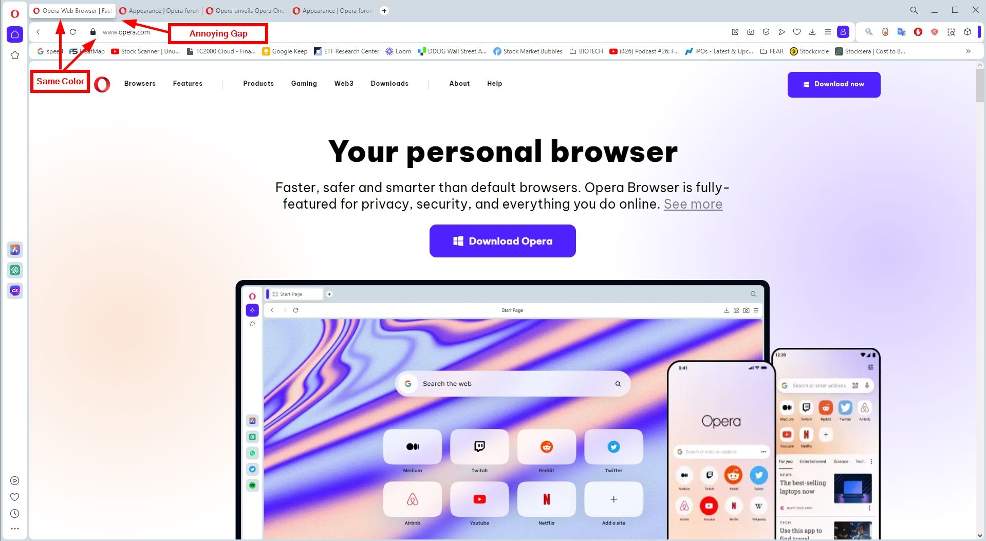
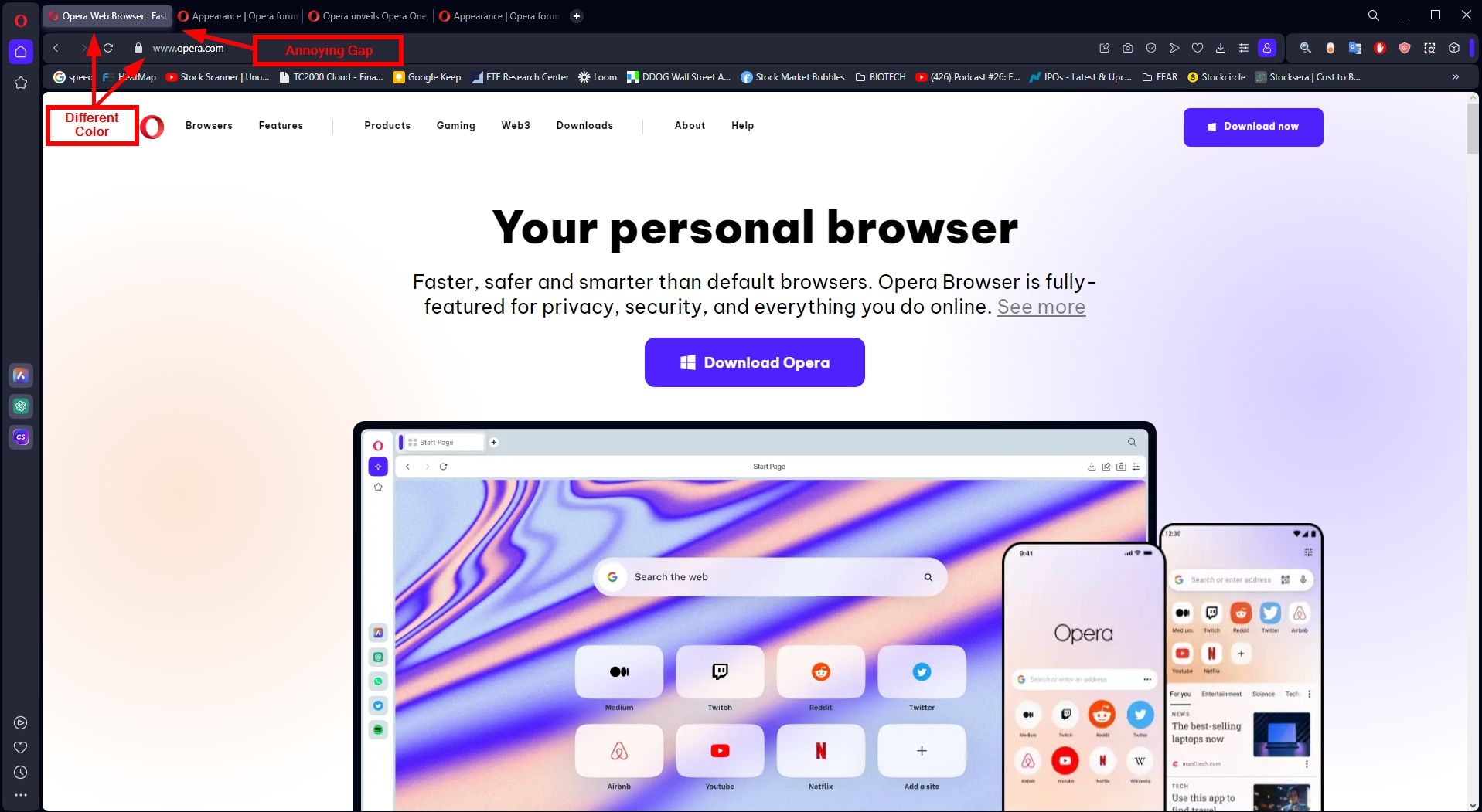
Opera, you need to address the tab colors and the design of the top section of the browser. It becomes challenging to discern content clearly with multiple tabs open, and the inconsistency between the light and dark themes is disorienting. For instance, in the light theme, the selected tab shares the same color as the search bar, whereas in the dark theme, it's the reverse. This inconsistency raises questions.
Furthermore, the excessive gap between the Tabs section and the search bar proves to be exceptionally bothersome. Although I don't typically exhibit traits of OCD, the usage of Opera One is compelling me towards such tendencies. The design appears to be subpar and does not provide an optimal user experience.
It would be greatly appreciated if you could offer users the option to revert to a classic look or provide increased customization options. The present layout feels distinctly "unnatural," to the extent that the browser's usability is compromised.
Thank you for your attention to these matters.


